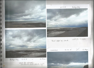
In this chapter I selected photographs that showed different colour and texture in water and sky.
1. The different drawing techniques use:
- Different drawing implements
- Layering effects using different implements
2. Sgrafitto
3. Frottage
4. Resist methods
5. Ink and bleach marks including discharge
6. Use of transparent surfaces
I used a number of photographs, selecting a few here which reflect the different techniques, colour and textures.
The first section particularly shows drawing techniques alongside the photograph with see also reference to Sections 2 to 6. For this blog, having already started on Chapter 2, the choice also relates to those photos selected for Chapter 2.
The first section is then followed by each technique Sections 2 to 6, not accompanied by the photo.
The samples are in a notebook and Health & Safety was applied through out.
1. The different drawing techniques use:
- Different drawing implements
- Layering effects using different implements
The different drawing implements include: Pencils, fine line pens, sepia artist pen.
These are also used in the layering effects alongside chalk and oil pastels, wax crayons, water soluble Inktense pencils, watercolour pencils, coloured felt tips, gel pens
Sample 1
Sample 2
Sample 3
Sample 4
Sample 4 and 5
Sample 5
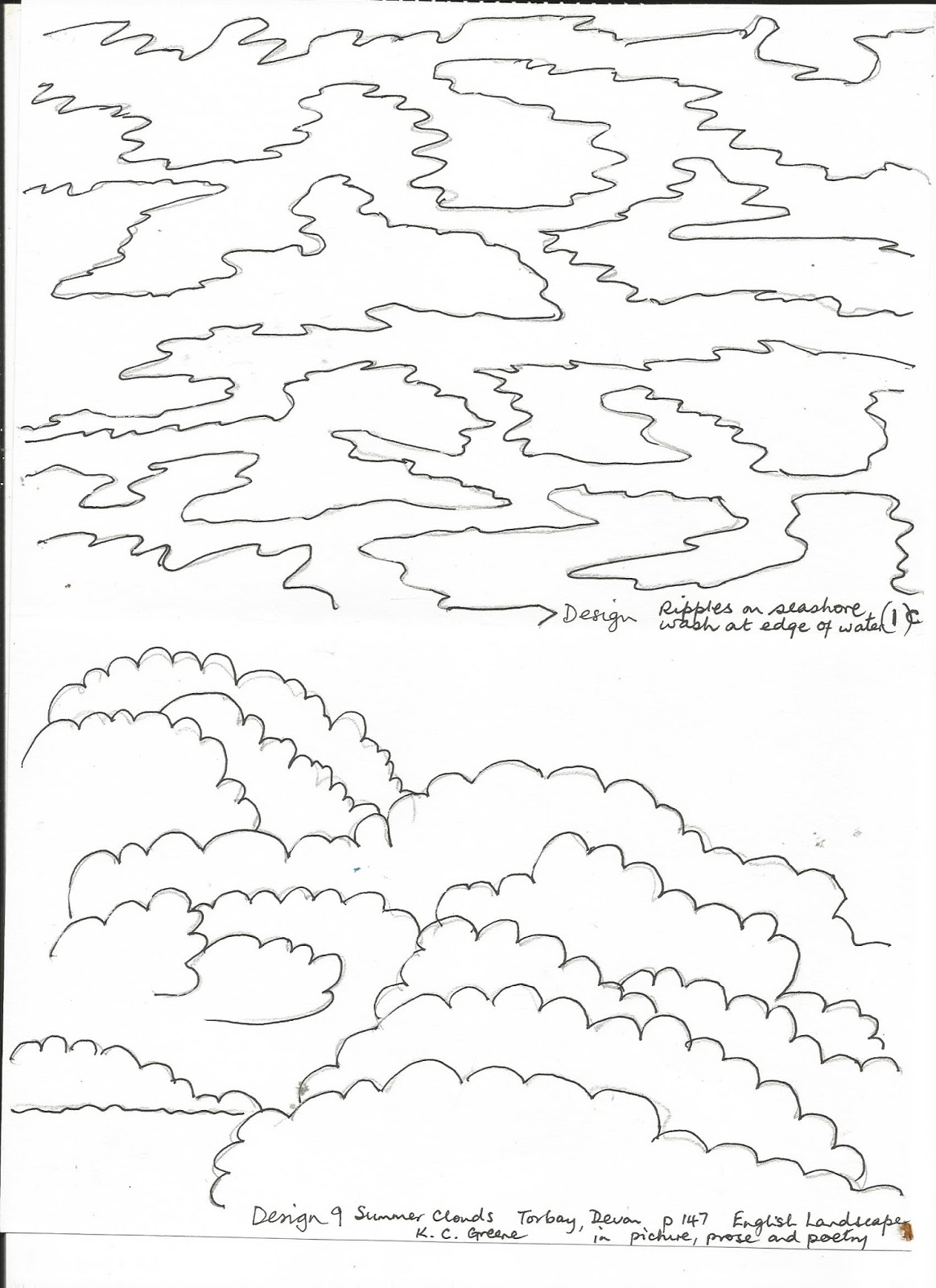
Sample 6 is of sea and cloud very grey in colour which were difficult to scan, used pencil and further work is in Chapter 2
Sample 7 is the lower picture of these two
Sample 8 as in Chapter 2 No drawings of these made whilst working on Chapter 1
2. Sgrafitto
Reference is made from photo page to any specific samples
These samples used chalk pastels with fixative using technique in Ian Simpson, 'Encyclopaedia of drawing techniques' page 53.
You can also use oil pastels with a layer of acrylic paint which saved time as you do not need to use fixative. Acylic pint takes less time to dry. I followed a technique used in Usborne book of art skills pages 86-87.
Here is a sample using black paper background
3. Frottage
Reference is made from photo page to any specific samples
These samples use different drawing implements and a selection of rubbing surfaces including: shaped cardboard grid, rush mug mat, Karantha stamp of waves, sequin waste, string and wallpaper stuck to card blocks, stretched plastic net over card, different sized corrugated card, cork mat, sponge cloth, and spikey stamp, on black or white A4 paper
Rather like the effect of colour and texture on black paper.
4. Resist methods
Reference is made from photo page to any specific samples.
In these samples I used white wax crayons, but could also use oil pastels, oil paint sticks or wax candles.
The marks were then coated with ink using different coloured inks from Winsor and Newton. These were very subtle coloured inks but still show where the wax crayons resisted the ink layer. Using white crayon allows white features to be highlighted.
5. Ink and bleach marks including discharge
Reference is made from photo page to any specific samples.
Here are mostly discharge samples using inks as the background then drawing with bleach using cotton buds, wooden skewers, cocktail sticks, and edges of cut cash cards.
When using other design requirements in later chapters I will use inks to draw on top of ink washes and with bleach drawings. Ink drawings as yet are only found on the photo pages.
Different inks have different resistances. I found the Newton & Windsor and Quink ink the most effective whereas Stephens ink was very resistant to discharge using bleach. I had a page similar to Page 2 shown below where the ink remained a solid wash.
I particularly like the bleach on ink using skewer and cash card it gives a sparkly effect like light on water on the bottom sample of page 1.
6. Use of transparent surfaces
Reference is made from photo page to any specific samples.
I collected together a wide range of transparent materials: hard plastic packaging, cellophane packets, greaseproof paper,
plastic wallets, different sized bubble wrap, cling film, plastic bags fine and thicker plastic, using different colouring techniques on them.
Using emulsion paint and clay paint with paint brushes. The emulsion paint on cellophane gave a bubbly more resistant finish, whereas the other finishes on other plastics were more solid streaked as with the brush. An unexpected result gives a reflected streak where paint from it stuck to another surface (third down) which could be used when depicting the sun or moon on water.
Using blue acrylic paint applied using sponge on shaped stencil on plastic wallet, gave a wonderfully watery wave effect. This was interspersed with a white equivalent, the shapes overlapping one another.
Bubble wrap was painted with acrylic paints.
The second sample was lightly pressed with an iron between baking parchment to protect the iron, giving a slightly flattened but alternative textured effect.
Heat on sandwich
a. of paint, threads and sequins like bubbles and ripples under water
b. of paint threads and bits of fabric and glass beads
c. small shavings of wax crayons with threads and bits of fabric
Like the way the plastic crinkles and seals the contents, and the way the crayons melted along creases.
It was amazing how quickly the heat effected the surfaces. Sometimes dissolving the plastic away leaving added texture.
Too much heat can over do the fusing, so it is probably best to start with a lower heat and then go higher for whatever effect is required. Unfortunately some of the glass beads were not trapped loosing some with gaps in the plastic.
Like the translucent and transparent effects useful for layering or using on their own as a surface.
I also liked (not shown here) painting between cling film using emulsion or acrylic paints. The surfaces sealed together and were then left to dry. Very quick ways of making layers to use on their own or over others.
Fascinated by the wide range of effects using colour and texture in this chapter and it should be interesting using and combining to get the effect required.


 .
.