Sunday, 13 September 2015

Chapter 1 Drawing methods

In this chapter I selected photographs that showed different colour and texture in water and sky.

1.  The different drawing techniques use:
  • Different drawing implements
  • Layering effects using different implements
2.  Sgrafitto
3.  Frottage
4.  Resist methods
5.  Ink and bleach marks including discharge
6.  Use of transparent surfaces

I used a number of photographs, selecting a few here which reflect the different techniques, colour and textures.
The first section particularly shows drawing techniques alongside the photograph with see also reference to Sections 2 to 6.  For this blog, having already started on Chapter 2, the choice also relates to those photos selected for Chapter 2.
The first section is then followed by each technique Sections 2 to 6, not accompanied by the photo.
The samples are in a notebook and Health & Safety was applied through out.

1.  The different drawing techniques use:
  • Different drawing implements
  • Layering effects using different implements
The different drawing implements include:  Pencils, fine line pens, sepia artist pen.
These are also used in the layering effects alongside chalk and oil pastels, wax crayons, water soluble Inktense pencils, watercolour pencils, coloured felt tips, gel pens
Sample 1
 Sample 2
 Sample 3
 Sample 4
 Sample 4 and 5
Sample 5
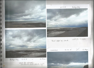
Sample 6 is of sea and cloud very grey in colour which were difficult to scan, used pencil and further work is in Chapter 2
Sample 7 is the lower picture of these two
Sample 8 as in Chapter 2 No drawings of these made whilst working on Chapter 1
 
2.  Sgrafitto
 
Reference is made from photo page to any specific samples
These samples used chalk pastels with fixative using technique in Ian Simpson, 'Encyclopaedia of drawing techniques' page 53. 
 
You can also use oil pastels with a layer of acrylic paint which saved time as you do not need to use fixative. Acylic pint takes less time to dry.  I followed a technique used in Usborne book of art skills pages 86-87.
 
Here is a sample using black paper background


3.  Frottage
 
Reference is made from photo page to any specific samples
These samples use different drawing implements and a selection of rubbing surfaces including:  shaped cardboard grid, rush mug mat, Karantha stamp of waves, sequin waste, string and wallpaper stuck to card blocks, stretched plastic net over card, different sized corrugated card, cork mat, sponge cloth, and spikey stamp, on black or white A4 paper


Rather like the effect of colour and texture on black paper.
 
4.  Resist methods
 
Reference is made from photo page to any specific samples.
 
In these samples I used white wax crayons, but could also use oil pastels, oil paint sticks or wax candles.
The marks were then coated with ink using different coloured inks from Winsor and Newton. These were very subtle coloured inks but still show where the wax crayons resisted the ink layer.  Using white crayon allows white features to be highlighted.


5.  Ink and bleach marks including discharge
 
Reference is made from photo page to any specific samples.
Here are mostly discharge samples using inks as the background then drawing with bleach using cotton buds, wooden skewers, cocktail sticks, and edges of cut cash cards.
When using other design requirements in later chapters I will use inks to draw on top of ink washes and with bleach drawings.  Ink drawings as yet are only found on the photo pages.
Different inks have different resistances. I found the Newton & Windsor and Quink ink the most effective whereas Stephens ink was very resistant to discharge using bleach.  I had a page similar to Page 2 shown below where the ink remained a solid wash.
I particularly like the bleach on ink using skewer and cash card it gives a sparkly effect like light on water on the bottom sample of page 1.


6.  Use of transparent surfaces
 
Reference is made from photo page to any specific samples.
I collected together a wide range of transparent materials: hard plastic packaging, cellophane packets, greaseproof paper,
plastic wallets,  different sized bubble wrap, cling film, plastic bags fine and thicker plastic, using different colouring techniques on them.
 
Using emulsion paint and clay paint with paint brushes.  The emulsion paint on cellophane gave a bubbly more resistant finish, whereas the other finishes on other plastics were more solid streaked as with the brush.  An unexpected result gives a reflected streak where paint from it stuck to another surface (third down) which could be used when depicting the sun or moon on water.


Using blue acrylic paint applied using sponge on shaped stencil on plastic wallet, gave a wonderfully watery wave effect.  This was interspersed with a white equivalent, the shapes overlapping one another.
 
Bubble wrap was painted with acrylic paints.
The second sample was lightly pressed with an iron between baking parchment to protect the iron, giving a slightly flattened but alternative textured effect.
 
 
Heat on sandwich
a.  of paint, threads and sequins like bubbles and ripples under water
b.  of paint threads and bits of fabric and glass beads
c.  small shavings of wax crayons with threads and bits of fabric
 
Like the way the plastic crinkles and seals the contents, and the way the crayons melted along creases.
It was amazing how quickly the heat effected the surfaces.  Sometimes dissolving the plastic away leaving added texture.
Too much heat can over do the fusing, so it is probably best to start with a lower heat and then go higher for whatever effect is required.  Unfortunately some of the glass beads were not trapped loosing some with gaps in the plastic.
Like the translucent and transparent effects useful for layering or using on their own as a surface.
 
I also liked (not shown here) painting between cling film using emulsion or acrylic paints.  The surfaces sealed together and were then left to dry.  Very quick ways of making layers to use on their own or over others.
 
Fascinated by the wide range of effects using colour and texture in this chapter and it should be interesting using and combining to get the effect required. 


Module 6 Creative Conservation Introduction

This is a brief introduction.
This is Module 6 where I look at the colours of sea and sky, exploring different drawing techniques.
There will be mixes of colour and texture translated into fabric and stitch to produce a wall hanging related to conservation on the topic of pollution.

I am collecting colour photographs including not only the sea but rivers and other water features and different skies.
I have taken new photographs and explored my collection to pick out different waters and skies from North Wales and elsewhere in the world from holidays.  As yet I have not defined them into a collection from different times of the day or seasons, but tried to gather those using different colours and textures in the surfaces and different weather conditions.

I am also starting to look at different painters and photographers who use water and sky as their inspiration. 
So far I've found a super book by Katharine Lochnan, 'Turner Whistler Monet'  which has a chapter 'The poetics of pollution' which highlights how pollution in London and elsewhere inspired their work.  Many fabulous illustrations.
Also, I went to a water colour demonstration by Frank Green a Liverpudlian who paints buildings before demolition, but he also captures weather, water and sky in several of his watercolour paintings around Liverpool.  The example in the demonstration was of Penmaenmawr seashore with amazing storm clouds, early morning, which I managed to photograph near by, later on the same day (second photo).

Here is just one or two photographs showing contrasts in weather, colour and texture.
Picture 4 was at Farncombe at the end of a busy Summer School day!


Saturday, 12 September 2015

Concluding items for Module 5

Here are scans of the sheets:
Evaluation of completed work

Authenticity of work

Saturday, 8 August 2015

Chapter 13 Artists

I have scanned the information related to four artists, which should be self explanatory


Friday, 24 July 2015

Chapter 12 Stitched trial samples using extreme contrasts working towards resolved sample

As mentioned at the end of Chapter 11 selected Torn shapes of photo 049a to work on.
This is an A5 size.

Drew up an enlarged preliminary design  with some initial ideas for fabric manipulation and stitches including being selective with fabrics I'd want to use.  This A4 size.

The idea is to take each textured area and translate it into manipulated fabric and/or stitch.

First of all I needed to reduce the number of pieces as shown below to areas A to F in white print.  These areas are mentioned throughout as work on samples


Another decision was to change the colours from yellow pieces with brown markings on black back ground to mostly cream on dark brown background using mostly brown range of coloured yarns.  It helps having black and white photocopies. 

Selected a range of fabrics


 and a number of different yarns from fine machine threads to chunky fraying variegated wool.


In order to have samples for each shaped piece made trial samples from them as they were of a manageable size.
The samples were laid on dark brown Dylon dyed linen scrim as they were completed.

I tried to no longer think of the original photo, but refer only to the marks for working.

The trial samples included three sets, so each shape was worked into three different techniques

First: Examples of fabric manipulated methods
Second:  Hand stitched methods
Third:  Combined fabric manipulated plus hand stitching including two  of each
           (i   Hand stitch on fine fabric then manipulated afterwards
           (ii  Manipulate fabric with stitch
           (iii Manipulate fabric then hand stitch on top
I aimed to have different contrasts of texture between one shape and another

For each, an initial idea was noted, allowing for changes of idea and technique as I reflected on fabrics and yarns available.  I noted main elements of techniques on the reverse of each sheet.

1.  Examples of fabric manipulated methods
The pieces as completed were pinned to the dark fabric background


Liked the way in A the silk pleated; the gather effect in B, gathers in D and scorched marks on calico using a soldering iron in E.

2.  Hand stitched methods


There was more use of coloured fabrics in these samples which were effective but prefer those with a more cream background, when considering the resolved sample.
Pleased with the wadded quilting in A and C, but possibly too thick alongside some of the other pieces; managed to get more layers of yarns in B and F

3.  Combined fabric manipulated plus hand stitching including two  of each
           (i   Hand stitch on fine fabric then manipulated afterwards
          (ii  Manipulate fabric with stitch
          (iii Manipulate fabric then hand stitch on top


In these samples in A felt the pleats with beading wire worked well, pleased I could work two types of quilting in C with feathers and sand then small area of Trapunto quilting and finally both E and F fine fabrics hand stitched with fly stitch on one, blanket stitch on the other varying and overlapping the stitches in keeping with the design shape and markings.  Liked the finishing touches using soldering iron on E, and in F folded layers for thickness with additional folding on the top layer with inserted pipe cleaners.
Here is a photograph of me surrounded by the samples, fabrics and threads as I stitched the beading wire through the pleats in A.


Resolved sample
In order to produce the resolved sample I selected two pieces from each type of work, arranging them on another dark brown fabric background.  I selected cream backgrounds to contrast with the background fabric and a variety of techniques.

The background was made up of two layers of fabric and as a token to the original seascape, machine stitched a basic picture of the shore looking out to sea.  Most is lost once the samples were put in place. 
Here is a photo of the resolved sample before the beading, with realistic colours.


Some beading with stitching to hold the pieces in place completes the resolved sample. (Note the sample is only pinned in place).  This was a night shot which has resulted in an apparent colour change.  See on above for the actual colour range.

 
plus hidden background(this is its appearance before pieces were added)


Whilst doing the trial samples also tried a knitted version of a different cut design, this time on a pale blue and light brown machine stitched background, not complete but an interesting idea.  This was not timed or costed.


Time taken for Chapter 11 - 10 hours
Time taken for Chapter 12 - 13 3/4 hours

Costs for Chapter 11 - £21.67
Costs for Chapter 12 - £11.80

Finally, I did go on to work with marked pieces on the course with Sarah Burgess ( not Summer School one), but these are yet to be completed.  Will send a photo of a couple of pieces when completed, not sure when.

This was a fascinating module and it gave me an opportunity to manipulate fabric and work with so many different stitches to interpret marks related to the seascape.  I feel I would like to develop further outside the requirements of the module using natural coloured manipulated fabrics and layering and developing use of stitch.  I feel I have a better understanding of the different properties of fabrics and yarns, and with experience will develop this knowledge even further.


Chapter 11 Design from landscape

The aim of this chapter is to use inspiration from landscape as in earlier chapters based on a seascape.
In this chapter I will decorate papers in flat texture and raised texture, cut and/or tear them based on shape in the landscape to make designs.

In sequence:
  • Selected landscape images, four views from Chapter 1
  • Decorated papers with flat and raised textures
  • Shapes collected by drawing a selection of divisions in the landscape
  • Cut and/or tore shapes related to various divisions in the landscape
  • Applied each images shapes to a contrasting coloured background paper.
Much of the work in earlier chapters has been done in black and white, for this work I have selected a main colour of brown with variations between cream and ochre, different browns and some orangey effects including gold

From the previous work I will select one design idea to use for manipulating fabrics and using different stitchery methods as shown in Chapter 12.  Notes on techniques were made as progressed through the work, applying H&S to methods.

Photo of prepared kitchen area where made marks on different papers - wide range of different thicknesses and colours of paper based on my colour decision


Decorated papers with flat and raised textures
Making flat textures
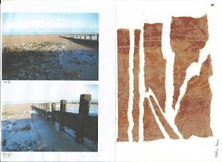
Initially I chose four viewpoints, shown here alongside flat textured papers:

Photos 044 and 048: mono-prints using hard roller with acrylic paints: burnt sienna, yellow ochre and gold
Making marks with sequin waste, cocktail stick, lollipop stick, sponges, stippled stamp, skewer and corrugated card


Photos 049 and 052: rubbings using oil pastels: yellow ochre, burnt umber, pale brown, ochre with sand, previous paper manipulation, seaweed, feathers, shells and wood grain in a door


Photo 049:  drawn scene using oil pastels as above and copper coloured markal stick over some rubbings


Photo 087:  mono-printing based on a course with Sarah Burgess (Embroiderers Guild N Wales, 20th - 21st June 2015)
These show some of the initial mono-prints, positive and negative images using special inks with some folded papers and different mark makers
The second photo includes use of masks, tearing and rearranging papers and inserting fabric


Making raised textures
Picked out textured surfaces by looking at all the pictures then applied different materials mostly to a layer of thick PVA glue with annotated explanation alongside.  Used techniques used earlier in Chapter 2 and in Module 3.
The surfaces were then rolled over gently using a mixture of acrylic paints: burnt sienna, yellow ochre and gold


Collection of surfaces using different materials:


Manipulating card to produce different layers


Shapes collected by drawing a selection of divisions in the landscape
Using the originally selected photos drew a range of pictures where the landscape was divided up into shapes following lines of main features.  I then selected 1 or 2 of each shaped arrangement and using the back of postcard sized pieces of selected flat textured papers drew the shapes then made a sample of a torn or cut shapes laid on to a contrasting coloured card.  The pieces cut or torn were replaced in the correct order with gaps between each.

Another approach might have been to select an abstract grid of squares, triangles or other shape, or produce a Fibonacci arrangement, but decided to develop one of the torn images

These examples showing the drawings on the first scan, followed by a reminder of the photo/scene and a resulting torn/cut layout from which a fabric and stitched piece might be made.

Sample 1


Sample 2


Sample 3


In the last of the above samples are drawings from the step photos and some examples showing how areas of shapes can be found by drawing around an area that you could possibly look through.
By this stage as I needed to choose just one image to develop further I didn't include the last image or torn, cut pieces realising I wanted to develop Sample 2.  In the back of my mind the textures of the wooden groin and seaweed effect seemed to draw me to developing this further.

The design which I decided to develop was the torn sample of  049a, which is developed in Chapter 12.