- Making a collection of papers
- Identifying simple shapes and patterns
- Design development using papers with shapes and patterns
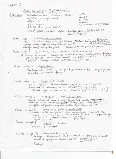
The document above is from my notebook. Each photo image was labelled having selected 1,2 or 3 linked images and then papers were made all A4 size using mark techniques used in chapter 1 appropriate to each image. On the sheet are those papers including techniques used. In order to coordinate the work rather than showing each section separately I decided to blog all three sections together for each of these images. The next sheet are notes for the design development stage showing the sequences of tearing or cutting to make the final sheets. I also tried to find background coloured papers appropriate on to which the cut shapes were stuck with prittstick. I tended to use A5 (half sheets) sometimes resulting in a new A4 sheet when combined.
Photo image 1 Pebbles next to the shore
Papers
Design development
I decided to tear the shapes as I felt this was more appropriate for the wash on a shoreline.
Note the subtle effect from one sheet overlaying the strong pebbles on the second sheet. An additional cutting of the patterned papers add another layer forming another watery image.
Photo image 2 Rich blue seas
Papers
Shapes and patterns
Design development
In these two pieces I've combined the sgraffito piece with the frottage, cutting the pieces for more emphasise on the waves. The one above shows the two layered shapes placed together the one below staggering columns to emphasise the waves even more.
Photo image 3 Reflections
Papers
Shapes and patterns
Design development
I played around with some of the patterns using the Windows 10 picture package
Photo image 5 Brown river or canal water
Papers
Shape and pattern
Design development
It does not show very well but the last piece is cut and staggered on aluminium foil giving a glittery effect of a watery sun on the brown waters
Photo image 5 Waterfalls on brown/green river
Papers
Shape and pattern
Design development
I also tried another cut and design which I felt didn't work too well (see below). I liked the top one but not the bottom
Photo image 6 Grey seas, skies and waterfalls
Papers
There is no shape and patterns or design development for this, however Photo image 8 relates well to the clouds effect
Photo image 7 Ripples in a pond
Papers
Shape and pattern
Design development
Photo image 8 Grey clouds and seaPapers - see those for Photo image 6
Shape and patterns
Design development
These images have come out brown rather than grey, which may be because the brown table reflected with the camera when taking the picture. The pieces were different tones of grey! not sepia!
Here are another couple of shapes that might be of use another time:
I tried to explore different shapes and patterns and using different design development. Although most were related to water I might like to develop clouds and skies more in the future, especially skies that are not just blue, white or grey.


No comments:
Post a Comment