In this chapter I will decorate papers in flat texture and raised texture, cut and/or tear them based on shape in the landscape to make designs.
In sequence:
- Selected landscape images, four views from Chapter 1
- Decorated papers with flat and raised textures
- Shapes collected by drawing a selection of divisions in the landscape
- Cut and/or tore shapes related to various divisions in the landscape
- Applied each images shapes to a contrasting coloured background paper.
From the previous work I will select one design idea to use for manipulating fabrics and using different stitchery methods as shown in Chapter 12. Notes on techniques were made as progressed through the work, applying H&S to methods.
Photo of prepared kitchen area where made marks on different papers - wide range of different thicknesses and colours of paper based on my colour decision
Decorated papers with flat and raised textures
Making flat textures
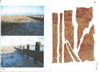
Initially I chose four viewpoints, shown here alongside flat textured papers:
Photos 044 and 048: mono-prints using hard roller with acrylic paints: burnt sienna, yellow ochre and gold
Making marks with sequin waste, cocktail stick, lollipop stick, sponges, stippled stamp, skewer and corrugated card
Photos 049 and 052: rubbings using oil pastels: yellow ochre, burnt umber, pale brown, ochre with sand, previous paper manipulation, seaweed, feathers, shells and wood grain in a door
Photo 049: drawn scene using oil pastels as above and copper coloured markal stick over some rubbings
Photo 087: mono-printing based on a course with Sarah Burgess (Embroiderers Guild N Wales, 20th - 21st June 2015)
These show some of the initial mono-prints, positive and negative images using special inks with some folded papers and different mark makers
The second photo includes use of masks, tearing and rearranging papers and inserting fabric
Making raised textures
Picked out textured surfaces by looking at all the pictures then applied different materials mostly to a layer of thick PVA glue with annotated explanation alongside. Used techniques used earlier in Chapter 2 and in Module 3.
The surfaces were then rolled over gently using a mixture of acrylic paints: burnt sienna, yellow ochre and gold
Collection of surfaces using different materials:
Manipulating card to produce different layers
Shapes collected by drawing a selection of divisions in the landscape
Using the originally selected photos drew a range of pictures where the landscape was divided up into shapes following lines of main features. I then selected 1 or 2 of each shaped arrangement and using the back of postcard sized pieces of selected flat textured papers drew the shapes then made a sample of a torn or cut shapes laid on to a contrasting coloured card. The pieces cut or torn were replaced in the correct order with gaps between each.
Another approach might have been to select an abstract grid of squares, triangles or other shape, or produce a Fibonacci arrangement, but decided to develop one of the torn images
These examples showing the drawings on the first scan, followed by a reminder of the photo/scene and a resulting torn/cut layout from which a fabric and stitched piece might be made.
Sample 1
Sample 2
Sample 3
In the last of the above samples are drawings from the step photos and some examples showing how areas of shapes can be found by drawing around an area that you could possibly look through.
By this stage as I needed to choose just one image to develop further I didn't include the last image or torn, cut pieces realising I wanted to develop Sample 2. In the back of my mind the textures of the wooden groin and seaweed effect seemed to draw me to developing this further.
The design which I decided to develop was the torn sample of 049a, which is developed in Chapter 12.


No comments:
Post a Comment